branding portfolio


Gabbey's Gang
this client was looking for a logo to advertise their nonprofit animal rescue
the solution
the process
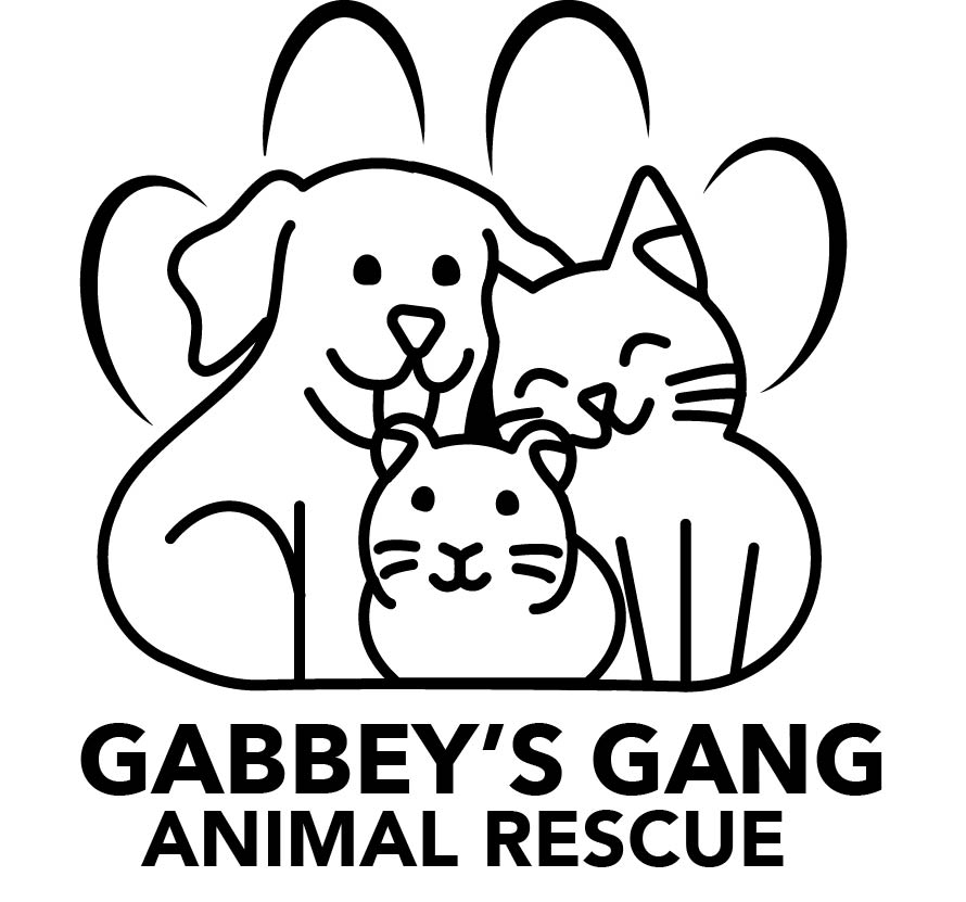
idea #1 friendly paw
The client's ideas for this design included:
incorporate a paw print or the G initial as in the name alliteration
show a variety of animals that the rescue will take in
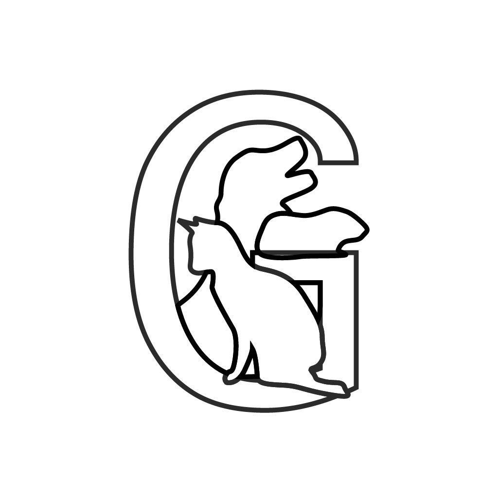
idea #2 mature initial
After viewing the first two sketches the client's feedback included:
choosing the cute paw design
fluffier dog
adjusting the cat's ear
the dark space between animals
closed design regarding the paw print background
In addition, I felt the faces of each animal needed more space to breath, further enhancing the "cute" factor
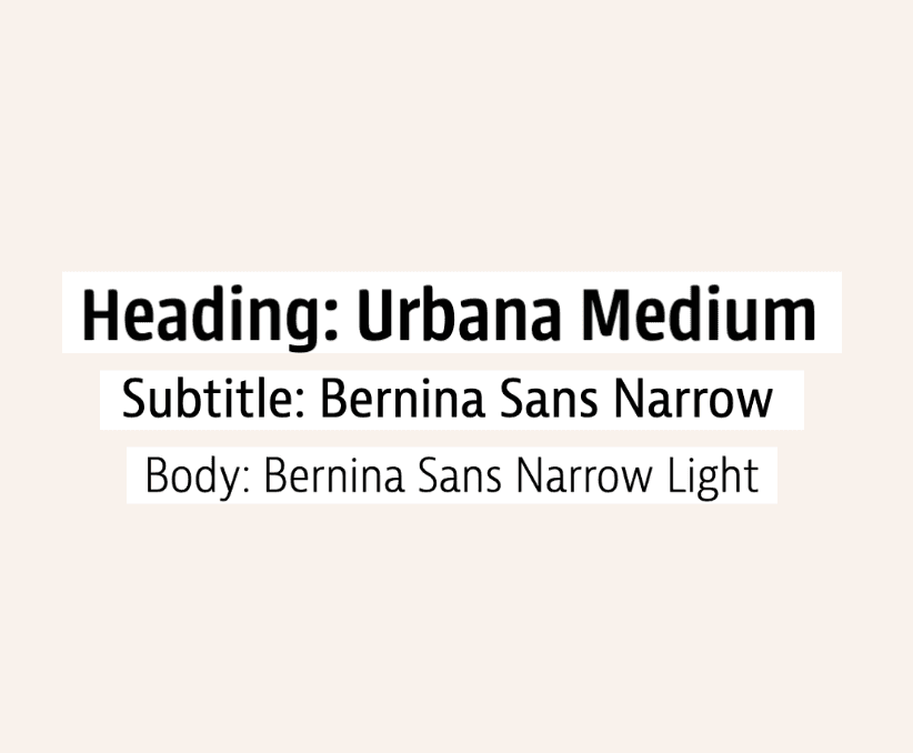
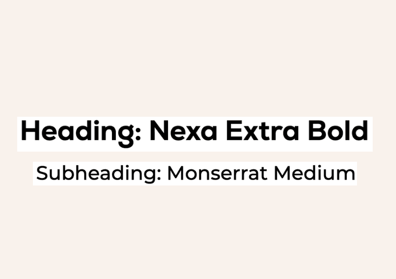
Typography
This sans-serif font pairing was chosen for their versatile, clean, and modern look.
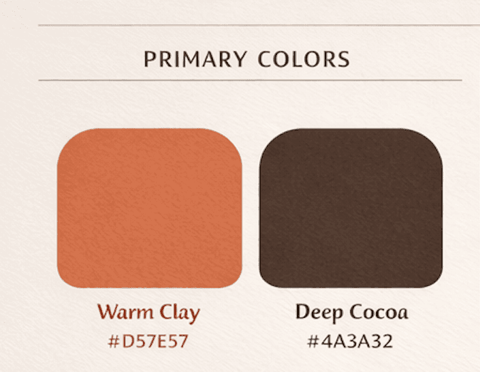
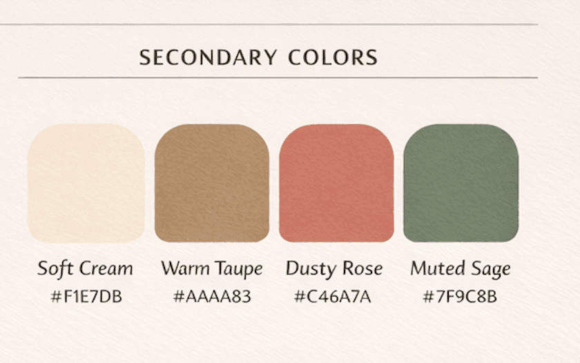
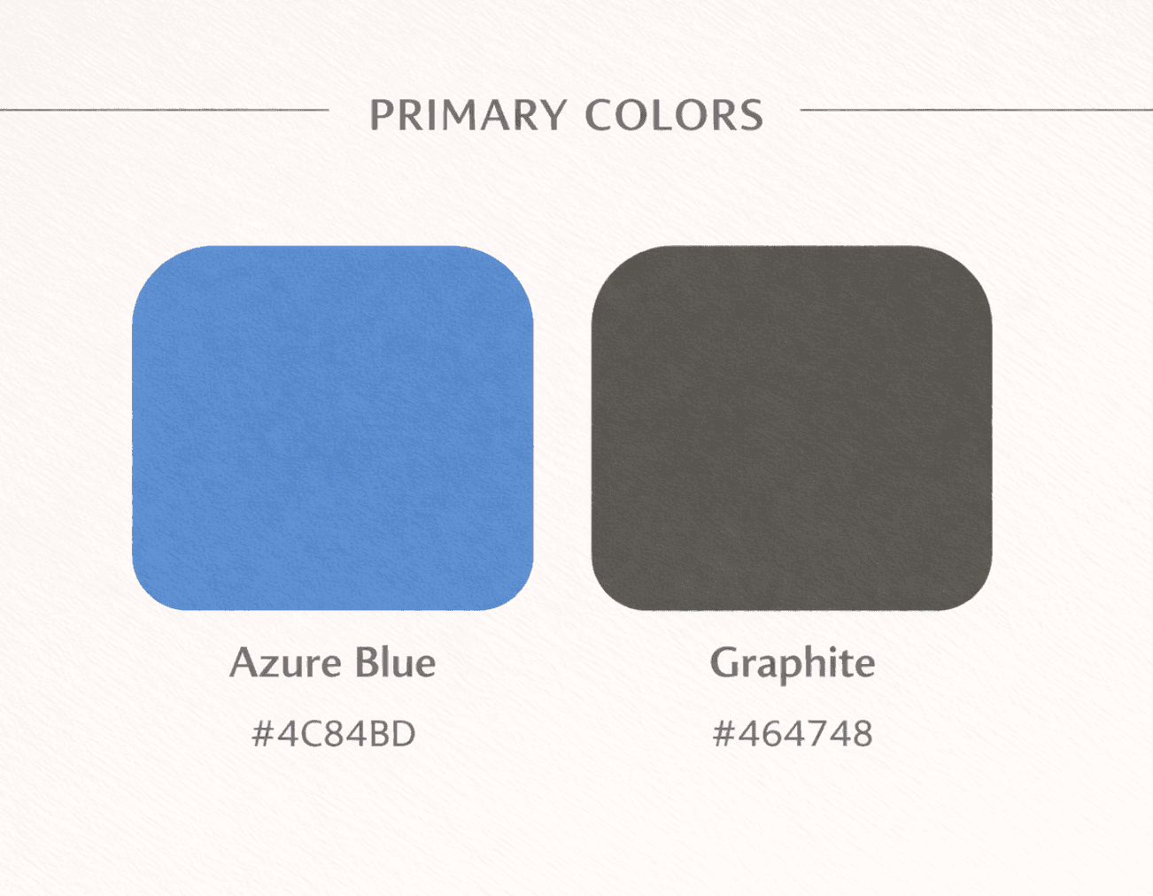
Color Palette
Warm, dusty tones that complemented the various colors of pet fur was the goal. The secondary colors were chosen to give additional options in marketing. The dusty rose is a nod to the color of a pets nose, muted sage chosen as a complement to the warm clay imitating a calico cat.
quick takeaway
Bringing this idea to life was rewarding because I could clearly see what the client wanted in my mind and then actually create it. It reminded me that good design isn’t just about making something look nice but also understanding a vision and turning it into something meaningful.
Jaeger Vending
This client, a family member, was looking for a logo and business card design to easily provide basic contact information for a vending machine business
the solution

the logo process
idea #1 flowy
The client's ideas for this design included:
vending icon
description words: convenience, healthy, professional

idea #2 serious
After viewing the first two sketches the client's feedback included:
choosing the straight-on forward facing vending icon
a cool color palette
additional logo in a circular form
final logo
plus an alternative for different applications

the business card process


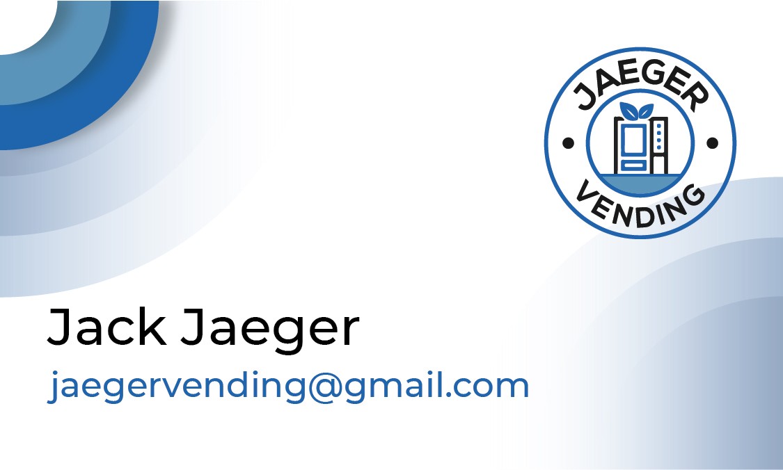
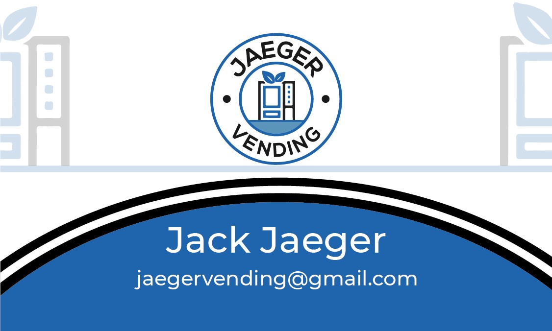
The client chose their business card (top left) after discussion on preferences such as:
- simple, less busy background
- largest text thats bold and legible from far
I personally like this choice as the centered and symmetrical design fits well with the straight lined logo and font choice giving it a cohesive professional feel.
Typography
These fonts were chose for its straight lined modern and professional appeal.
Color Palette
Requesting cool tones, blue was chosen for the color psychology of stability and dependability. Better yet blue is a commonly used color for liquids, such as those sold by the beverage vending machines.